Slate Gun Deaths Visualization
Link to the Slate Gun Deaths Visualization
Overview
This application visualizes gun deaths in the United States from Dec. 14, 2012 to Dec. 31, 2013. The data is provided by Slate and is available to download from the article How Many People Have Been Killed By Guns Since Newtown? The tool allows you to explore temporally and across scales, drilling down to see data from a specific time period and state. You may also compare the distribution of the selected subset against the Nation.
Visual Design and Interaction
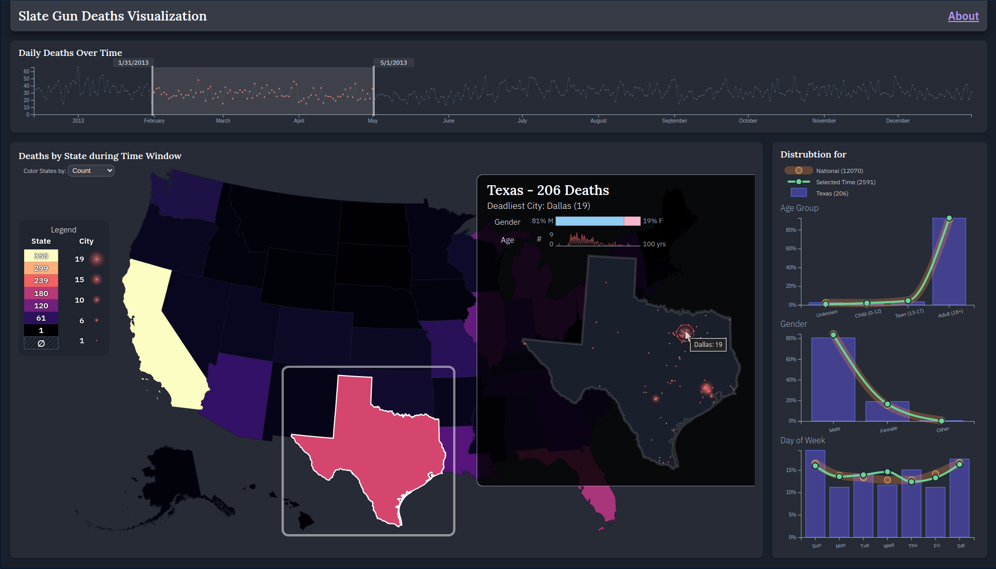
This tool is designed to be highly interactive and to visualize an appropriate level of aggregation at different levels of analysis. There are 4 main views in the tool: the Timeline, the Map, the State Overlay, and the Distributions.
Selections made in the Timeline propagate through the rest of the views. When a time window is selected in the Timeline, the Map and State Overlay will update to show data only within that time range, and the Selected Time series in the Distributions view will update. Selecing a state on the Map acts to open the State Overlay and show detailed information about gun deaths in that state. Additionally, the Selected State series in the Distribution view updates with the newly selected state. As a user makes selections, new aggregates for each view are computed interactively from the full dataset.
Timeline
The Timeline view plots the daily gun deaths over time and supports a brushing opertaion to select a time range for the other views.

Map
The Map view allows a user to choose one of three attributes to plot gun deaths by state:
- Total Count (can be seen in the image at the top of the page)
- Mean Age (first image below)
- Gender Proportion (second image below)


State Overlay
The State Overlay shows more details about the state which was selected on the map for the selected time range. This information includes the:
- total count of deaths,
- deadliest city and its death total,
- gender distribution of deaths,
- age distribution of deaths, and
- location and total count by city plotted across the state
For the state map, the size of the circle encodes the count for that city.


Distributions
The Distributions view supports comparison of the data distribution for 3 attributes: Age Group (as defined by Slate), Gender, and Day of Week.
In a chart for each attribute, we can see the distribution at the National level (thick orange line), the National level for the Selected Time (green line), and the State level for the current time window (purple bars).

Sources
Data
- Slate Gun Deaths (CSV): How Many People Have Been Killed By Guns Since Newtown?
- 10m State-level Shapefiles: @topojson/us-atlas
- Favicon: favicon.io